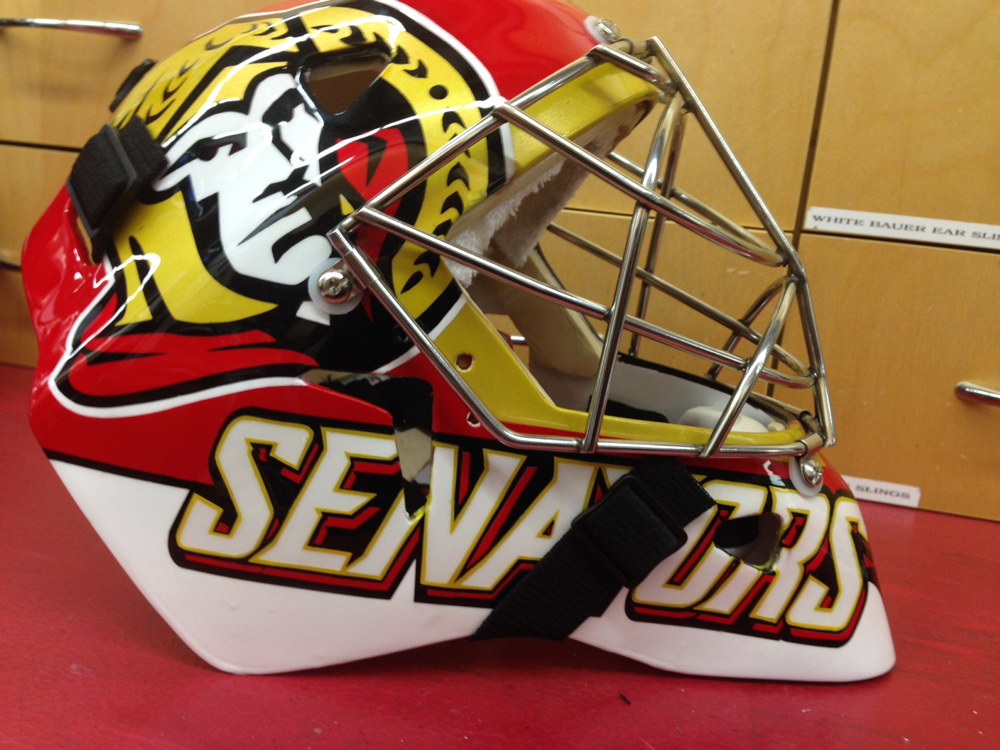
From the right: You play for the logo on the front, not the name on the back.
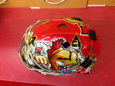
Top: Not much to say here. Great view of the iconic Peace Tower, which I wanted to incorporate this season.
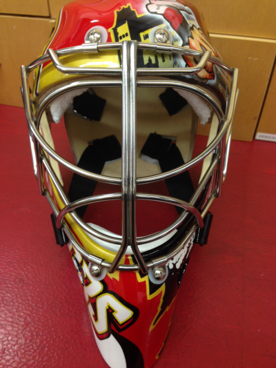
The front: I love those double bars, gives me great vision. (no, a puck can’t fit in there!)
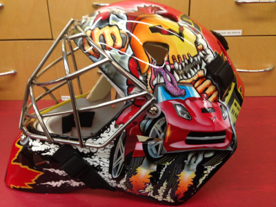
The left side: Staying consistent, but I’m not going to lie – I love the new stingray. So it gets the usual Corvette treatment, and my artist put the heritage “O” on the shoulder of the monster driving it.
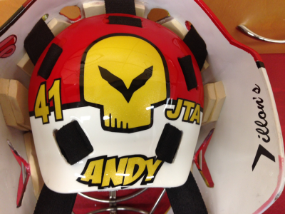
On the back: Most important are my son’s initials – everything I do is for him and my lovely wife. I think the rest is self explanatory.
